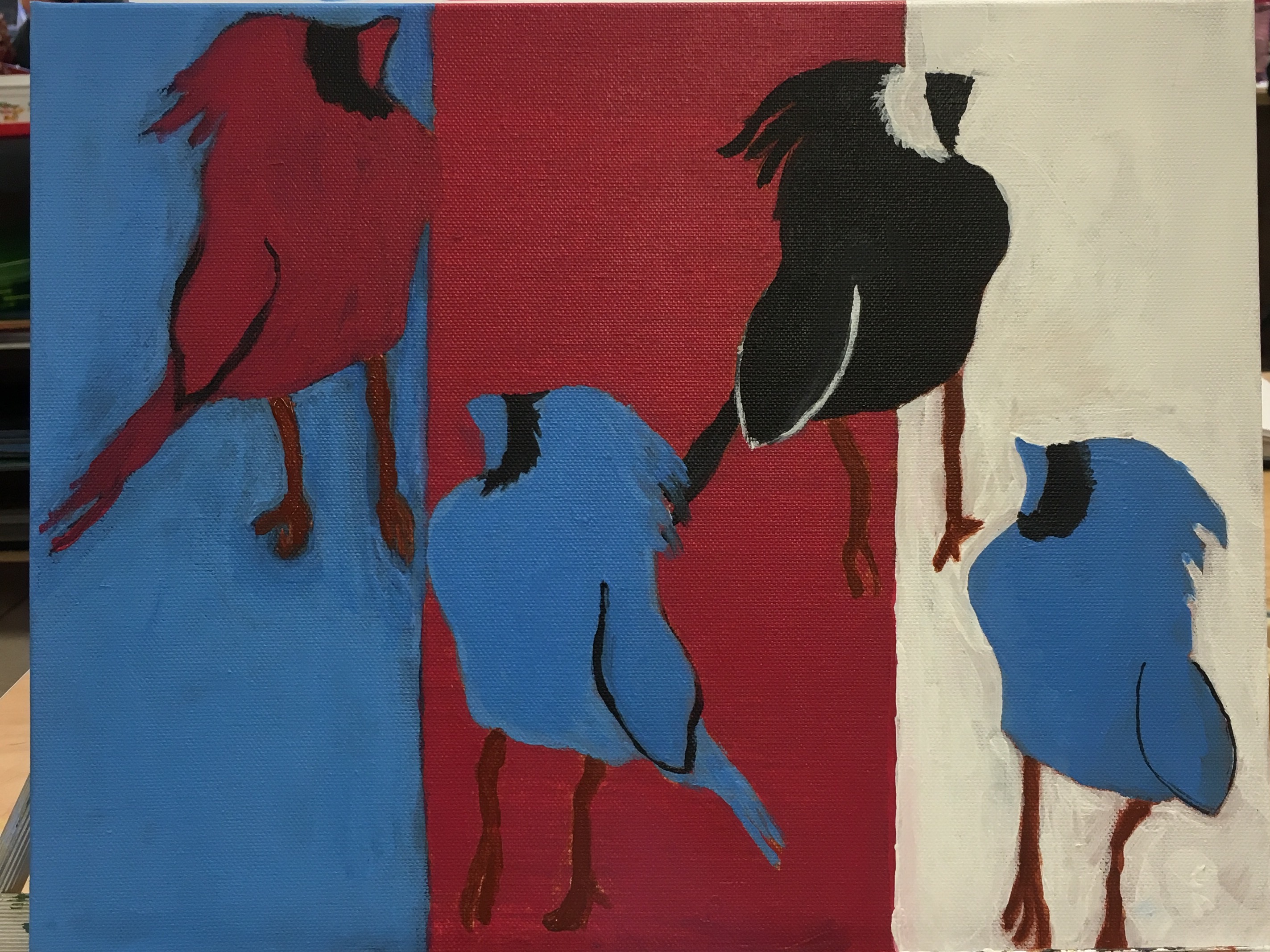
 Even before we started planning, from the very moment Mrs. Rossi announced that we would be painting (and it wasn't water color) I knew it would probably be the best project. I realized quickly that we would have to write a paper and mimic the style of our chosen artist, but it did provide incentive and inspiration and I was completely happy with my artist. I took my time on this painting. It was the very first time I ended up having to come in during lunch to finish! I like the contrast of the colors and how it pops out. The cartoony aspect of Pop Art really makes it suitable for my wall, since if I did buy art this is the kind of stuff I would buy. All in all, this was a great project that all Art 2 kids should get to experience and enjoy.
0 Comments
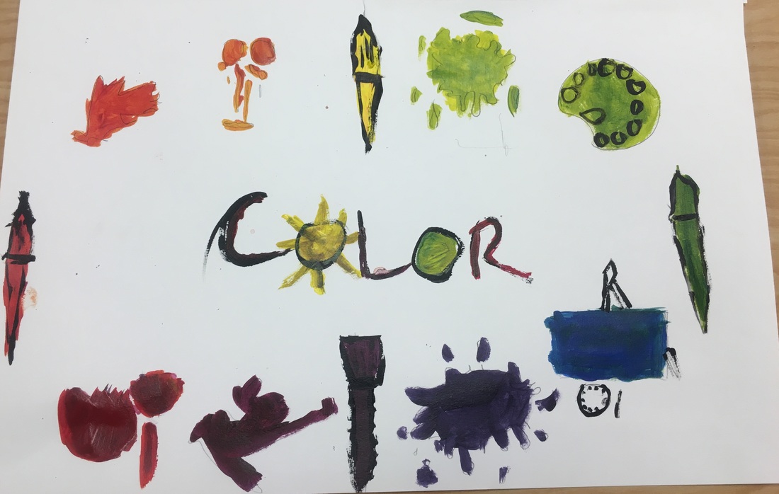 Our assignment was to be original with a color wheel! I thought what better way than with symbolizing paint? I don't really like how it turned out, though. If I had taken my time and not been as sloppy, maybe I could make the objects look a bit more like what they're supposed to be. I did realize though, that painting is more fun free form to me.
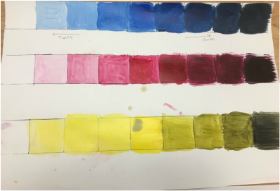 At first I thought, "Why are we making another value chart?" I quickly realized that mixing acrylic paint into different values is a bit more tedious than Pen and Ink or Colored Pencils. This value chart took me twice as long as any of the other value charts we did. One thing I noticed is how subtle the value change is, and any little amount of paint can change the entire color. This made me realize that when learning any new medium it is best to start with the basics.
|
AuthorMy name is Dayton and I am a senior in Art 2. Archives
January 2017
Categories |
 RSS Feed
